Friday, 27 February 2015
Digipak final draft
As i wanted a more professional feel I have decided to make the font black with a white outline, this incorporates the feel of the light and dark like shown in my music video, and also the feel of love through the font used.
Thursday, 26 February 2015
Directors commentary
As in every piece of work you always feel like you could do better, but in this case things could have gone a lot worse. I went from two completely different story lines to getting frustrated with transitions, however, I can say not only did I impress myself with the work that I managed to do with this project but I also managed to impress my target audience group to the point that they said they would download the video to watch on an everyday basis.
Furthermore, the differential clips show a unique aspect on the power of love. Love the strong word that gets everyone weak at the knees, in this music video you see the true pain of losing someone you love and this was the plan, to show that in life you can grow stronger from the pain you have been through and that you can always overcome the worst.
The camera angles that I have used in my music video show the emotion of a break up and also the main actress coming through the end. The reflection of the past when she was happy to the pain of the break-up to the end where she comes to terms with being on her own and being okay with it.
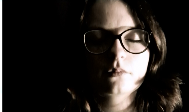
The effects that i have used show the contrast between pain that she has been through and the 'happy days'. As you can see the yellow editing shows the happiness of the summer romance, and the darker copper shows the binary opposite.
Not only did producing this music video help my technological skills but it made me realise how people see music videos and how it can relate to real life. Additionally how it is important to listen and take into consideration all aspects of what your target audience. If i could go back and do anything again it would be learn more technological advance skills to broaden the professionalism of my music video.
Furthermore, the differential clips show a unique aspect on the power of love. Love the strong word that gets everyone weak at the knees, in this music video you see the true pain of losing someone you love and this was the plan, to show that in life you can grow stronger from the pain you have been through and that you can always overcome the worst.
The camera angles that I have used in my music video show the emotion of a break up and also the main actress coming through the end. The reflection of the past when she was happy to the pain of the break-up to the end where she comes to terms with being on her own and being okay with it.
The effects that i have used show the contrast between pain that she has been through and the 'happy days'. As you can see the yellow editing shows the happiness of the summer romance, and the darker copper shows the binary opposite.Not only did producing this music video help my technological skills but it made me realise how people see music videos and how it can relate to real life. Additionally how it is important to listen and take into consideration all aspects of what your target audience. If i could go back and do anything again it would be learn more technological advance skills to broaden the professionalism of my music video.
Target audience awareness
To get feedback that is recorded and accurate I have put the digipak on my social media site, Facebook, which won't cause inconvenience to my target audience as they can all put what they think on my page and I can take their feedback and amend any changes.
Digipak Draft 2
This is my digipak draft two, I have listened to the feedback from my target audience and incorporated what they have said and taken everything in to consideration. what they would want to see and if it would attract them to buying the album.
Feedback for my digipak second draft
As people in my target audience has a split opinion on the font i have decided to keep the font as it is, as it is the feel that I want the target audience to feel, as the font gives a feel of love and the difference between love and lust.
Wednesday, 25 February 2015
Feedback from target audience for Digipak
The target audience said a number of things that really helped me understand my digipak from another perspective, with the use of colours and different text how it convey and create a different mood.
Member one, is a a girl aged 16 who is a media student herself, she said she likes it, however the text that lists the songs it's too light.
Member two, is again a female, aged 19 said she loved the effect that i have put on the photographs and she agreed with the first member that said about the colour of the font.
Member three, is male, he is age 16 said not only does he likes the images but he also like the added effect of the quote by Shakespeare he said it gives it another element of emotion.
Member four is female age 17 she loves all aspects of the digipak however she agrees with the first two members about the colour of the font.
All in all this was a very successful draft one as they have given me both praise and helpful feedback that i can change and add to my digipak.
Member one, is a a girl aged 16 who is a media student herself, she said she likes it, however the text that lists the songs it's too light.
Member two, is again a female, aged 19 said she loved the effect that i have put on the photographs and she agreed with the first member that said about the colour of the font.
Member three, is male, he is age 16 said not only does he likes the images but he also like the added effect of the quote by Shakespeare he said it gives it another element of emotion.
Member four is female age 17 she loves all aspects of the digipak however she agrees with the first two members about the colour of the font.
All in all this was a very successful draft one as they have given me both praise and helpful feedback that i can change and add to my digipak.
Digipak Draft One
This is my first draft of my Digipak, as you can see the sepia tones connotes the feel of love with the light pink shading gives the meaning of love. The addition of the quote gives the album a more loving feel to which the audience can relate to.
Subscribe to:
Posts (Atom)


