Furthermore, the light blue theme is carried through with the blue font and the blue sky. Also the white font carries through with the top which makes the advert flow.
It is has the information is clearly put at the bottom which gives the audience the details to pre-order and pay for this album, which is obviously the goal for the artist and the producers.
Additionally the background image gives the album artwork a sense of familiarity with the audience, which will entice the audience more to buy the album.

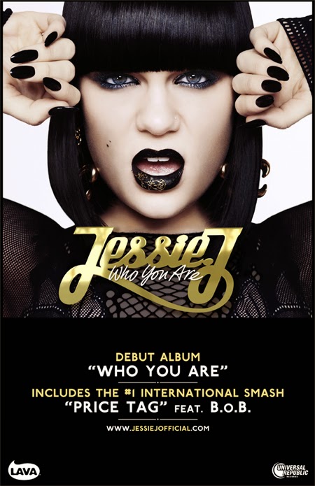
Jessie J, Who You Are, the black, gold and white colour scheme gives the impression of Jessie J own personal look, with the signature bob and the black nails and lipstick shows the continuity through out the process of the album advertisement.
Like Lana Del Ray's Born to Die it also has the important factors of the record label and her own website where fans can receive information about the upcoming release.
It mentions the number one international smash hit with B.O.B which will entice her fans and audience to buy the album as if they have listened to the song they will be more interested to see what other hit tracks she has on offer to listen to. Also including the fact that it is her Debut album will also interest her fans as it will be her first public album.

No comments:
Post a Comment